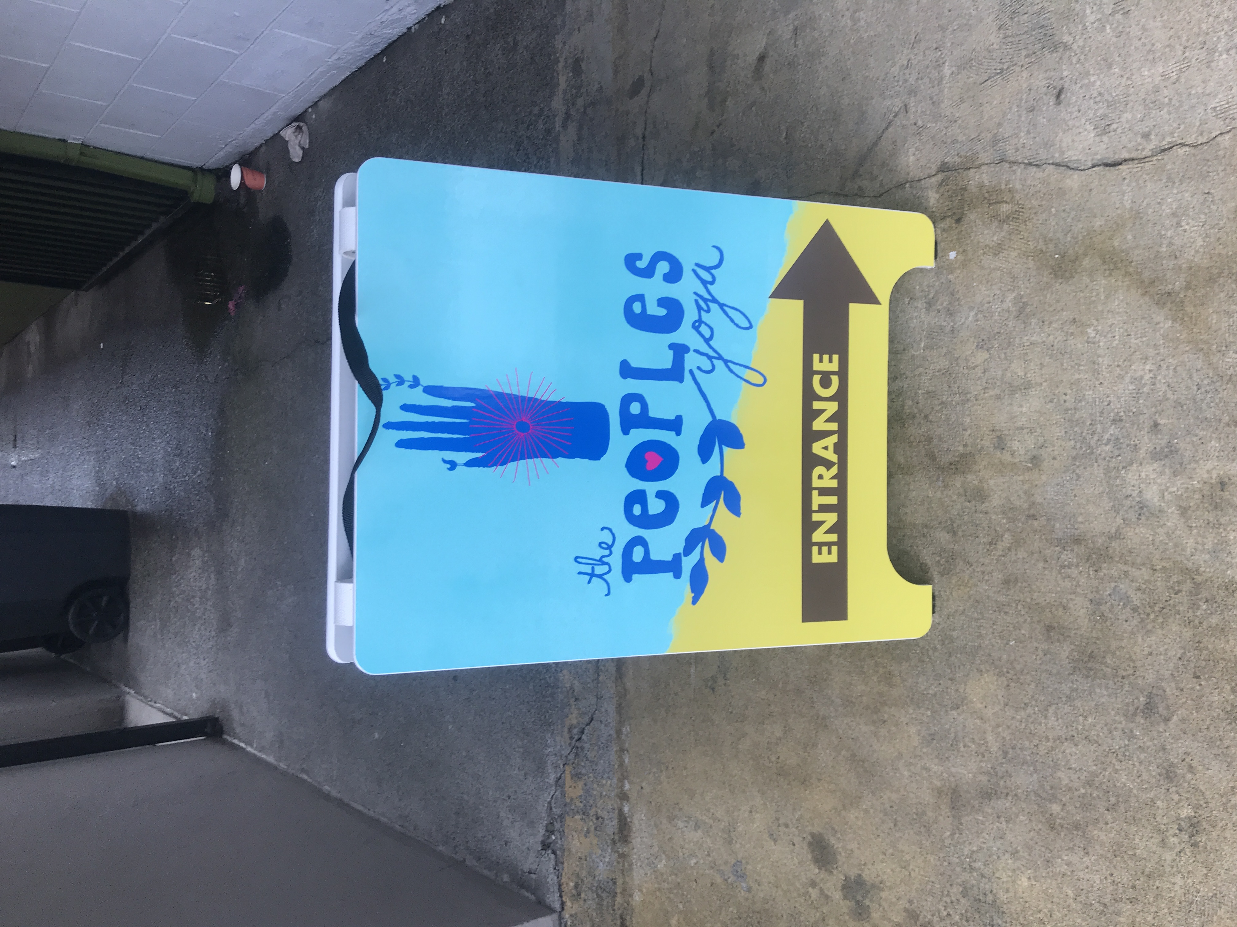
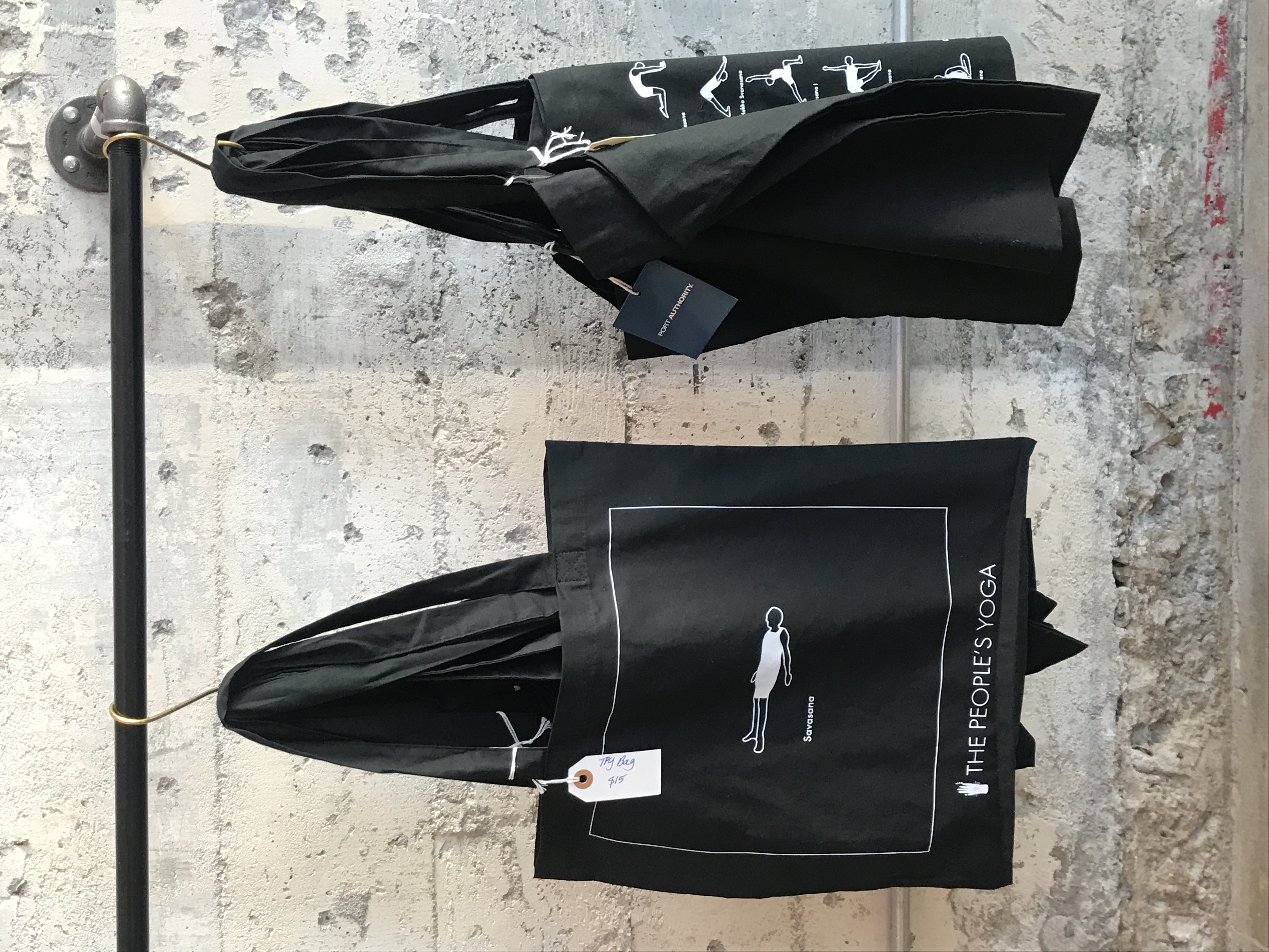
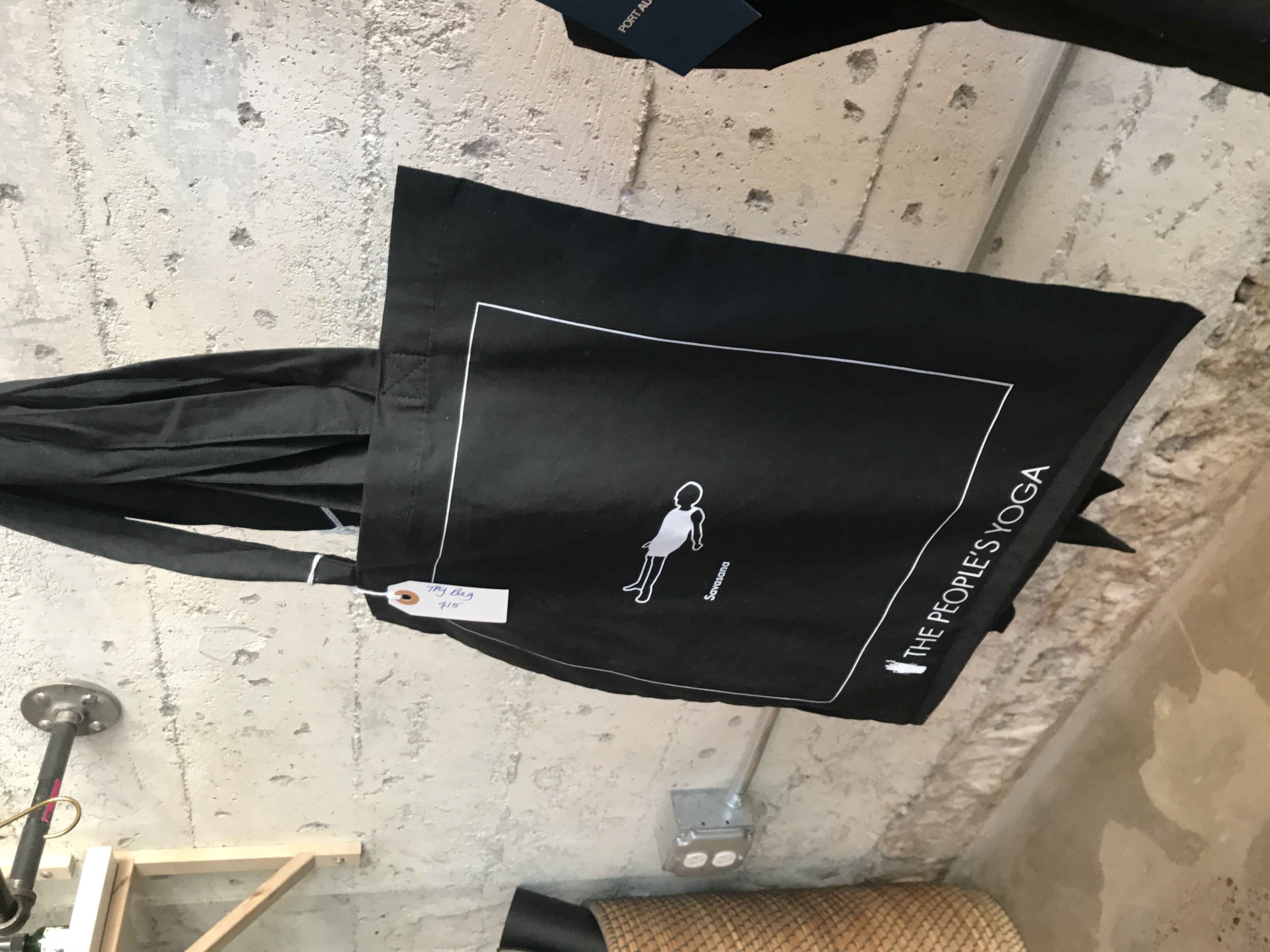
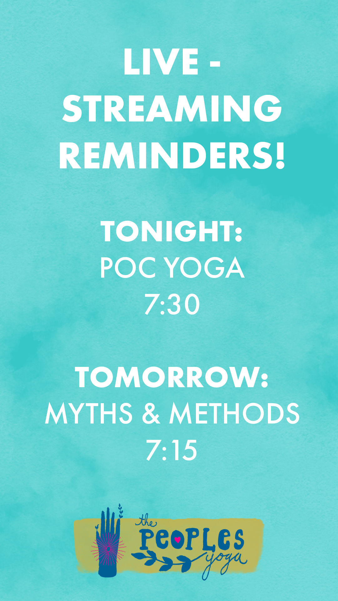
10. The People’s Yoga


As the Brand Director of The People’s Yoga, I was in charge of all things ‘Design + Brand’ that went out into the world. This included digital content, web assets, printed materials, sidewalk signs, shop window decals, flags that hang from the lights on the sidewalk (what are those called again?) and the overall look and feel of the Brand.
When I first began, TPY had already been established for nearly 10 years, but had limited consistent branding materials, and definitely no Brand Book in any way, shape or form. We also did not have the assets to do a whole brand re-fresh right away, although that’s what the owner would have liked.
Instead, we made small changes over-time to establish a brand. This included choosing consistent colors for social, web and brand. Developing a consistent voice, and launching new social initiatives, all of which I was in charge of.
TPY remains the original, low-cost studio, full of yoga misfits and unlikely crowds. The branding had to follow that message, that this is yoga for EVERYONE. And not just Lulu Lemon’s version of everyone, but actually all people - and occasionally pets! Over the last two years, I still hear positive feedback about the changes that were implemented during my time there - and I am proud to have worked with such an awesome local business ︎︎
brand direction
art direction
mailchimp assets
digital design
print design
print production
merchandise design